
twojskup.pl: rebranding and website for a property buyer
A project from brand to launch for a property buying company: visual identity, website and a three-step valuation form instead of one long field.
- Service
- Custom Web Development
- Timeline
- 2 months
- Team
- 5 people
The challenge
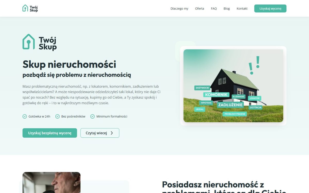
The client buys problem properties (with tenants, bailiff proceedings, debts or several co-owners) and had a good service but weak conversion. In this industry, trust decides whether people get in touch: clients entrust the company with a difficult, often family matter. Meanwhile, the website did not build credibility, the form was too simple to guide users through a valuation, and visually the brand was no different from its competitors. Each of these quietly cost the company inquiries.
The solution
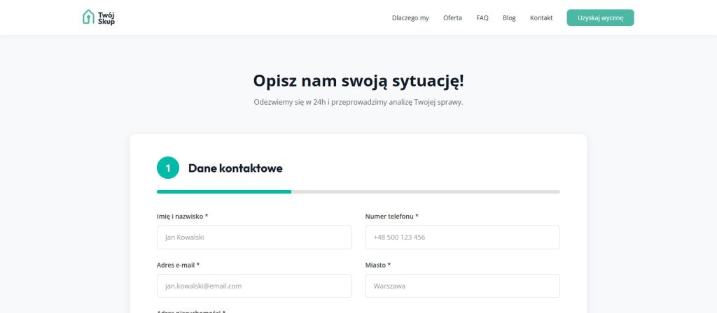
We took the project from zero to finish: visual identity, logo, color and typography system, then UX, design and implementation on our WordPress base theme. At the heart of the website is a multi-step form. Instead of one long field, it has three steps with a clear progress bar: contact details, property details (type, floor area, condition) and additional information, such as the land and mortgage register number. Credibility comes from a description of the five-step process, client stories, an FAQ and a blog.
Scope of work
-
Visual identity
Logo, colors, typography and brand rules from scratch, consistent across all materials.
-
UX and design
Competitor research, a customer journey map, and interface and form design in Figma.
-
Valuation form
3 steps (contact details, property details and additional information) with step-by-step validation, transition animations and an email notification.
-
Implementation
Implementation, Core Web Vitals optimization and a CMS that is easy for the client to use.
Technologies
More projects
Full portfolio →
Facing a similar problem?
Describe it in three steps and we will reply within 24 business hours with questions or a first proposal.